New Zealand Hospitality Product Palettes Collection
Return to HospitalityOverview
Aotearoa is a land of great contrasts and diversity.
From towering mountain peaks to spectacular caves. Deep glacial lakes to crystal clear rivers. Lush bush to long sandy beaches.
The Interface Design Studio has curated a series of palettes that celebrate the organic colours and textures of New Zealand’s natural landscape. Capturing nature’s most inspiring elements, these palettes offer a beautiful and vast array of colour variation.
Colour has a profound influence on how people perceive and react to their surroundings. The product combinations in the palettes can be used to inspire particular moods in different spaces.
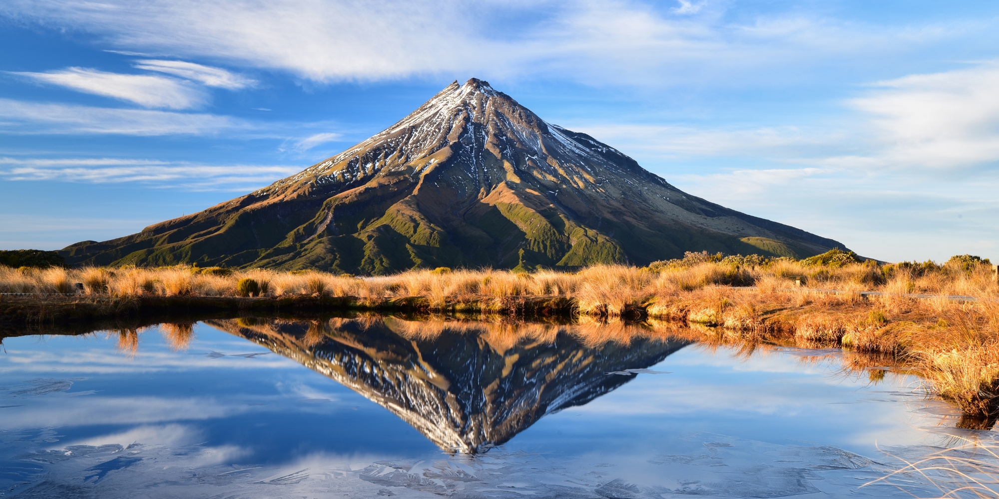
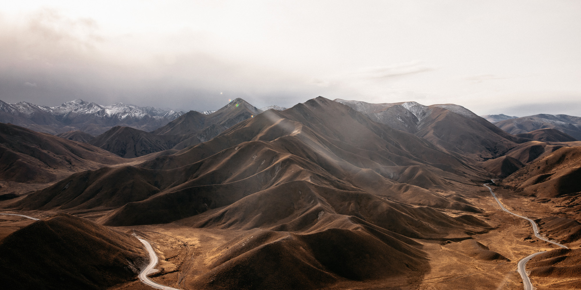
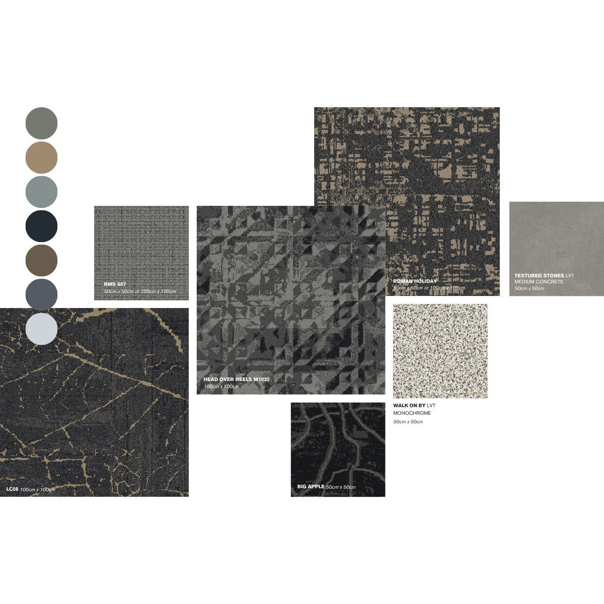
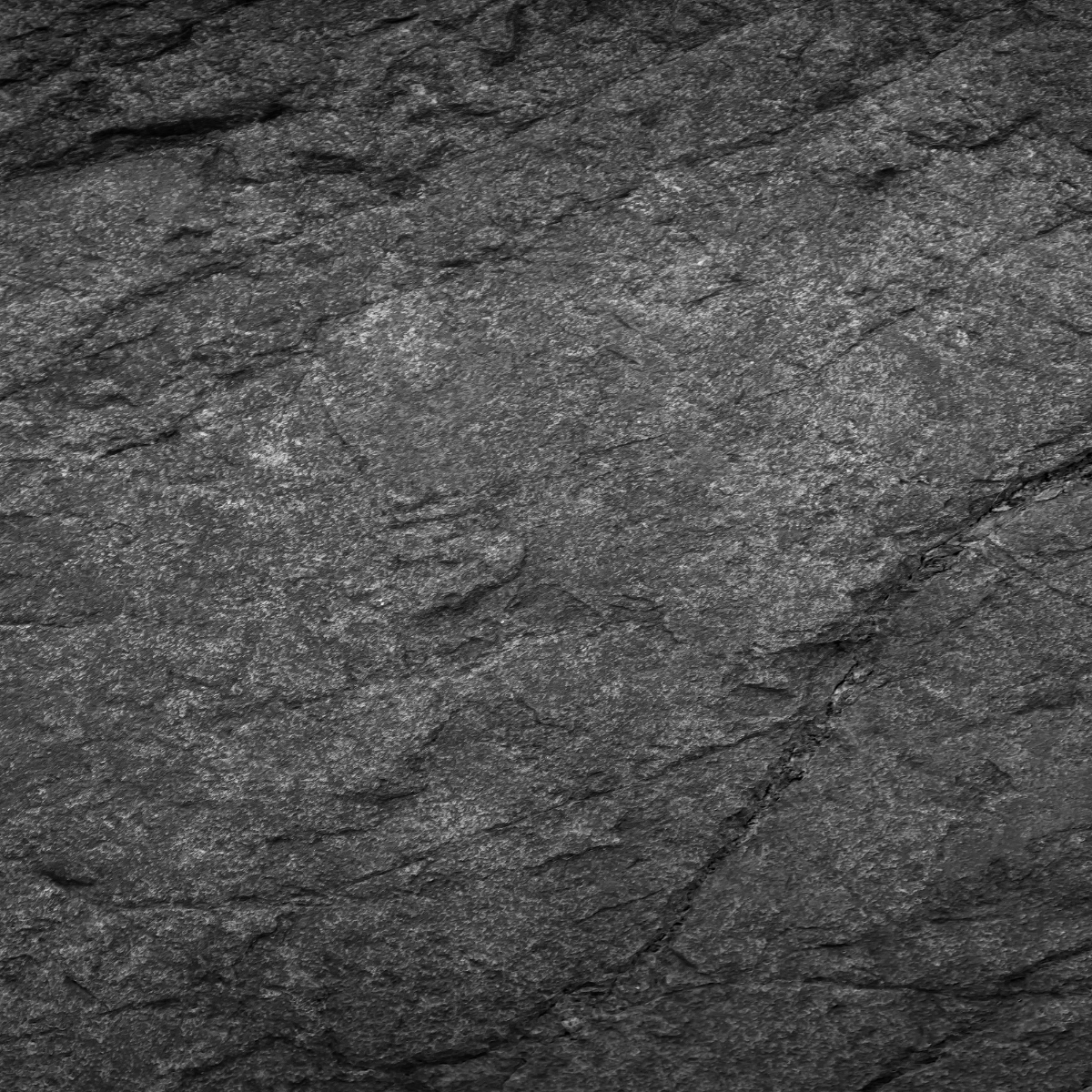
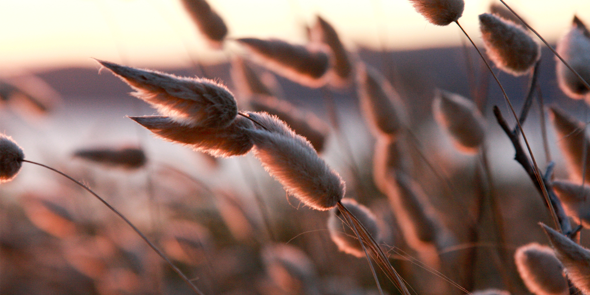
Mountain Palette
Maunga
Inspired by New Zealand’s vast mountain ranges, the Maunga palette encapsulates the juxtaposition of harsh rock forms and soft tussock grasses. Capturing the essence of the elevated environment, this palette features subtle, refined textures and broad organic forms. When utilised in a space, neutral and natural beige tones are understated yet offer a warmth and reassuring sense of calm to guests. These colours soften hard edges, bringing depth and richness to a monochrome interior. Brown tones and darker greys evoke opulence and indulgence, while greys offer cool serenity.
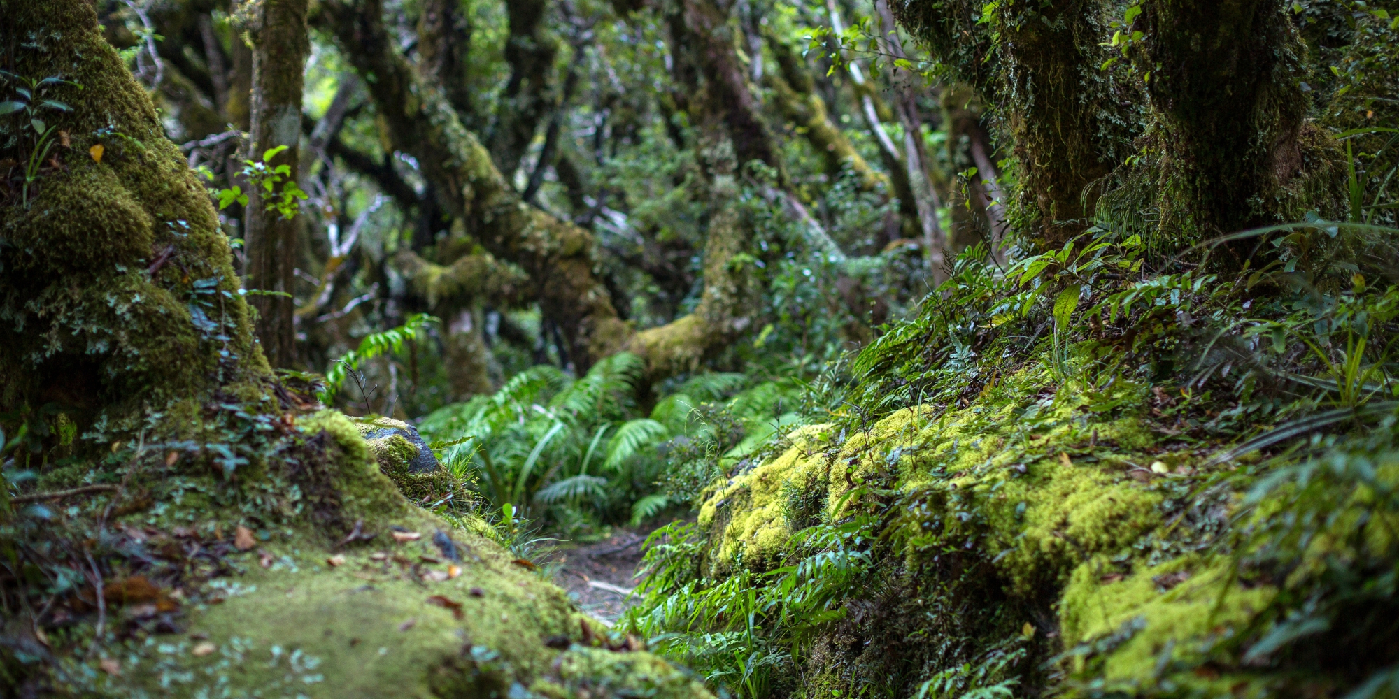
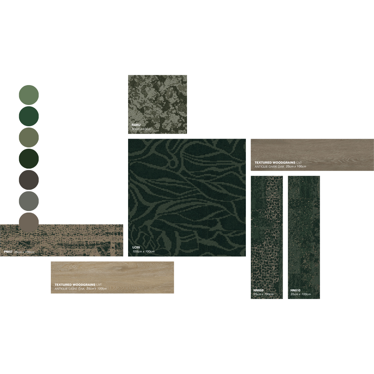
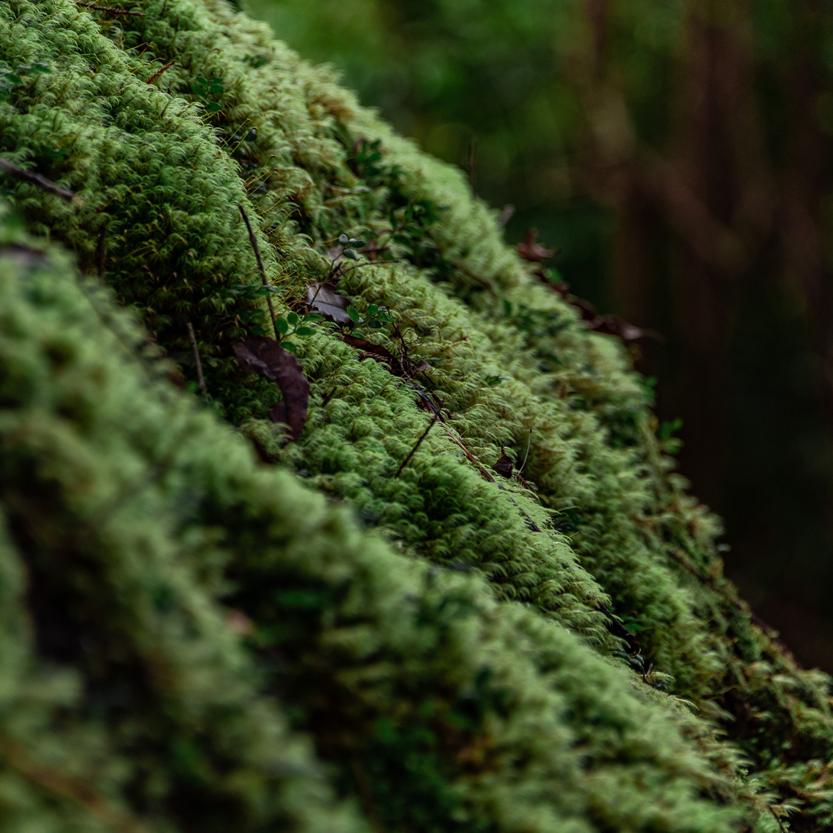
Bush Palette
Ngahere
The lush native bush of Aotearoa is the source of inspiration for the Ngahere palette. Moving from the bush canopy down to the layering of ferns and mosses at ground level. These elements produce a sense of serenity and peacefulness, perfect for private guest rooms and quiet spaces. Capturing the essence of the bush, this palette reflects our innate affinity with nature, championing the verdant green tones and rich browns of our precious native trees. Bringing green hues and natural references into a space can help create an environment that connects users with nature while enhancing a feeling of comfort and relaxation.
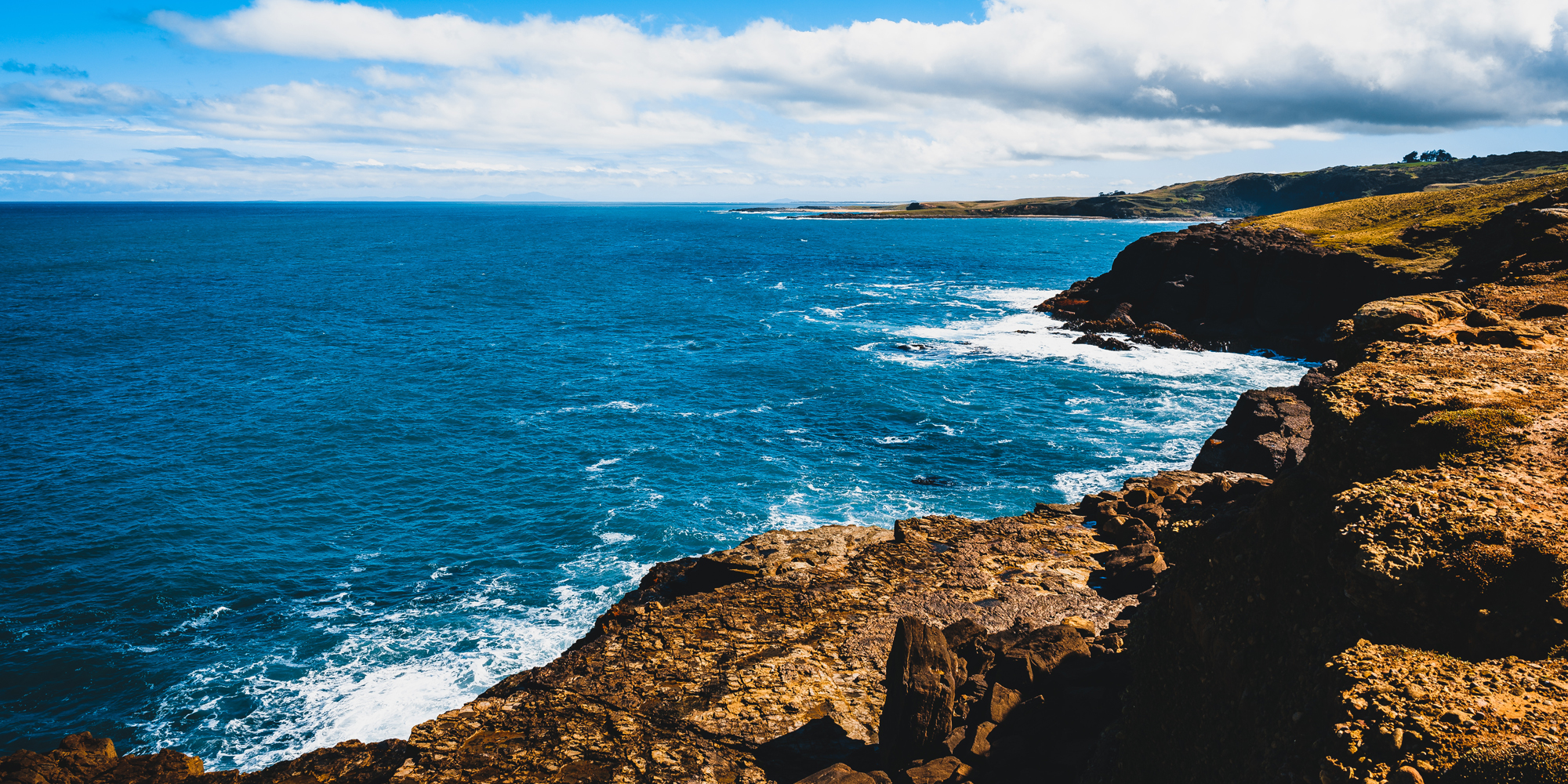
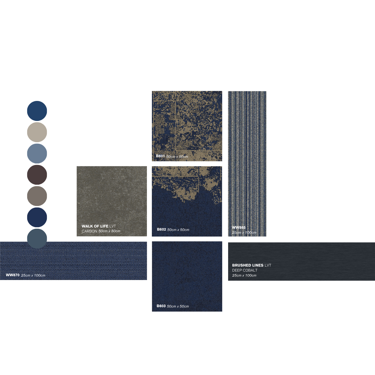
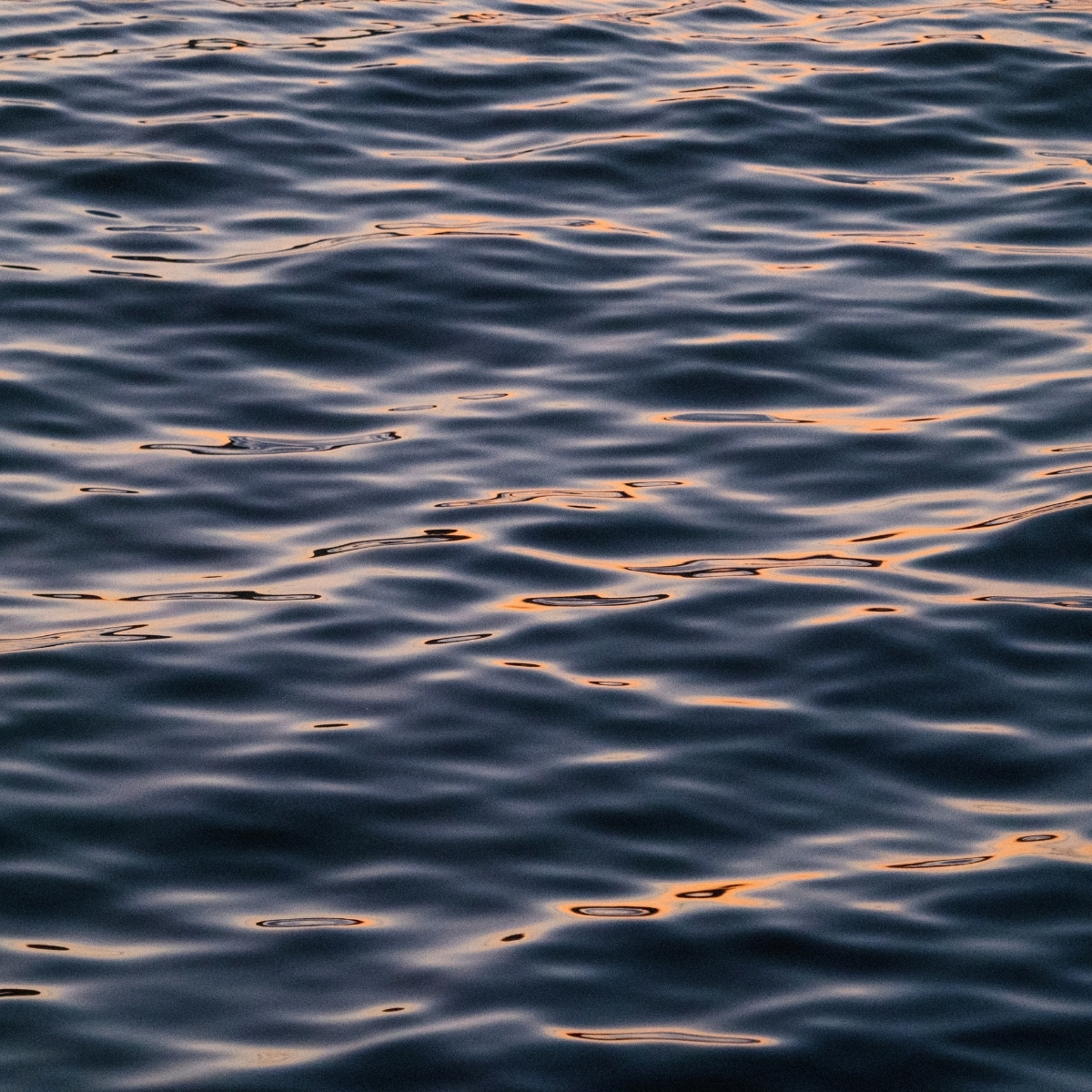
Sea Palette
Moana
The Moana palette is inspired by the strength and intense beauty of the Pacific Ocean. Bold shades of deep navy and cool blues are reflective of both the sky and sea. Appealing to our natural instincts, blue is tranquil, timeless, and adaptable to many types of interiors. Soft blues can evoke a sense of calm in a private guest room or quiet space, whilst darker, richer blues enhance a luxurious feel. Brighter and stronger shades can be invigorating and add a sense of liveliness in public spaces designed for socialisation and fun.
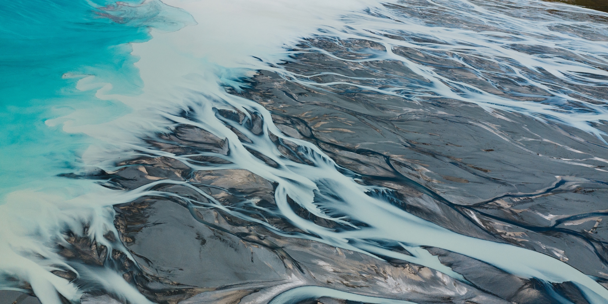
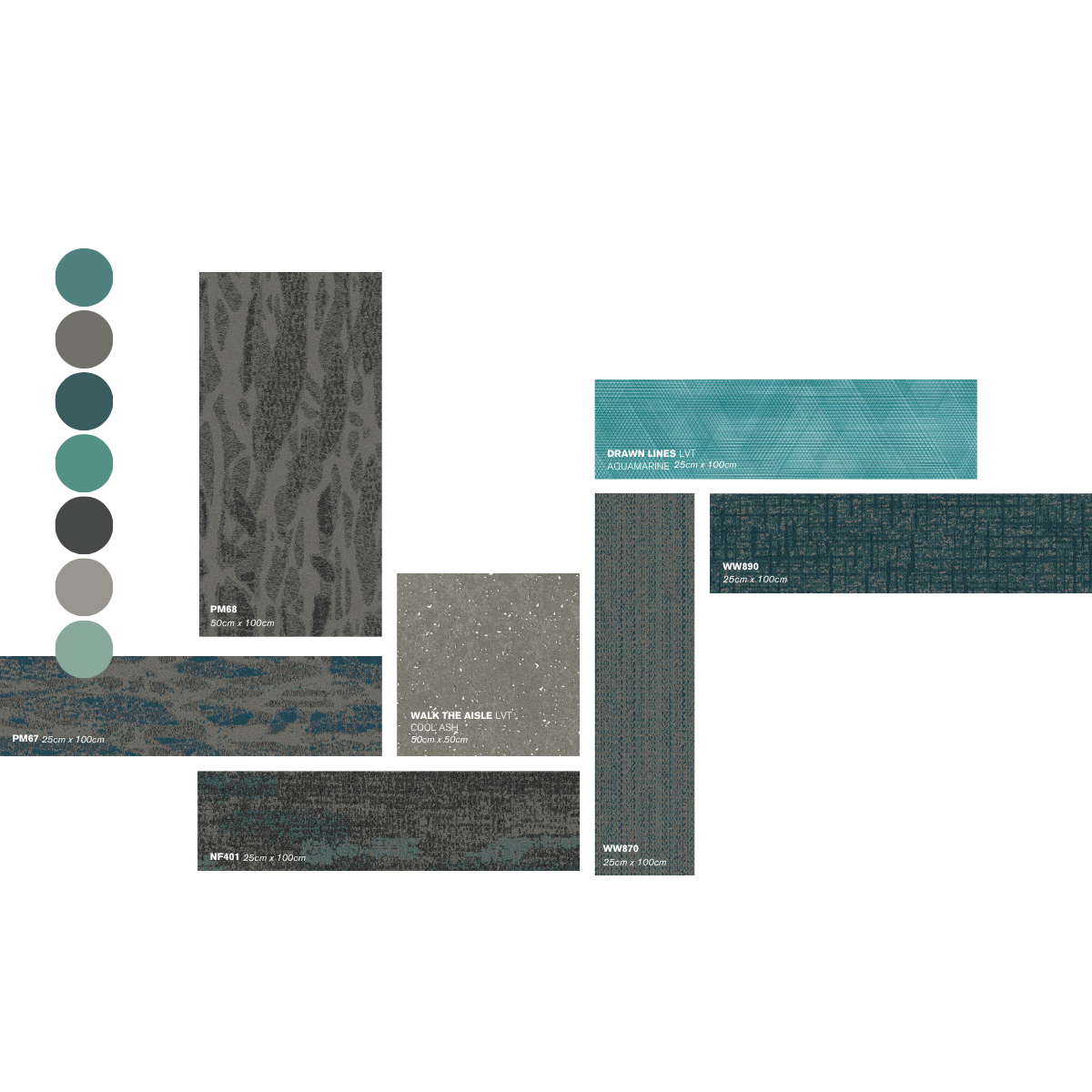
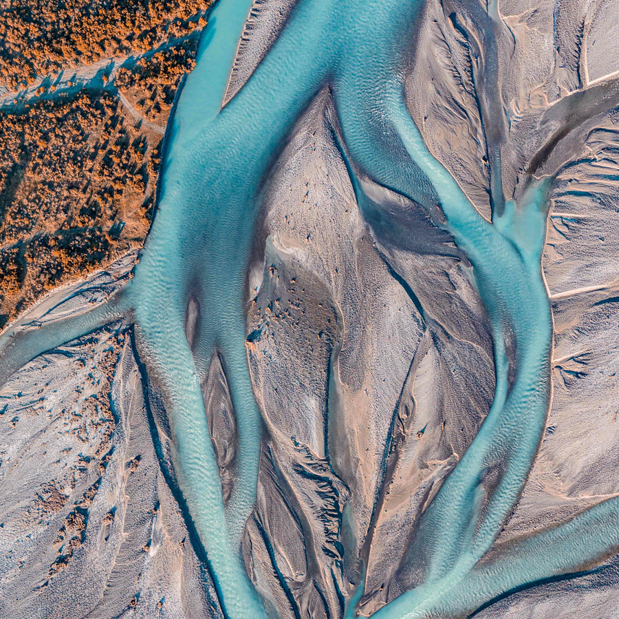
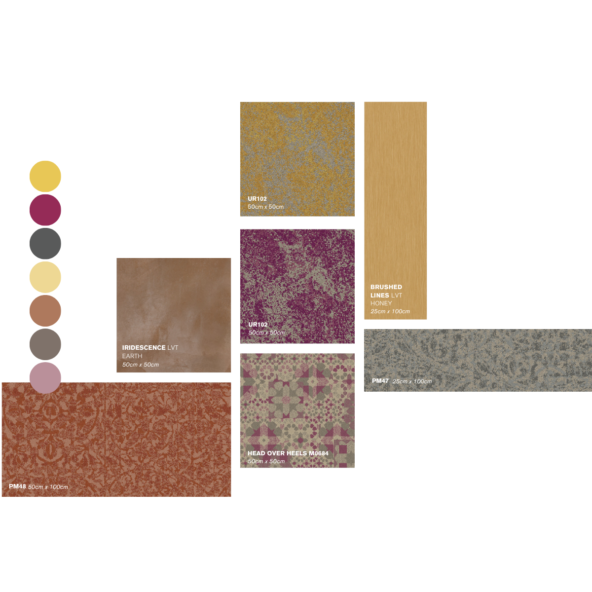
River Palette
Awa
Vibrant shades of teal alongside stony neutrals found within the rivers and lakes of Aotearoa have been the source of inspiration for the Awa palette. Turquoise and aqua shades complemented with fine-detailed patterns provide strong direction when designing spaces. Pastel blues offer a refreshing and revitalising contrast to the more subtle greys.The Awa palette brings together organic and softer tones that create an inviting, resort-like atmosphere, providing guests with a reassuring sense of calm.
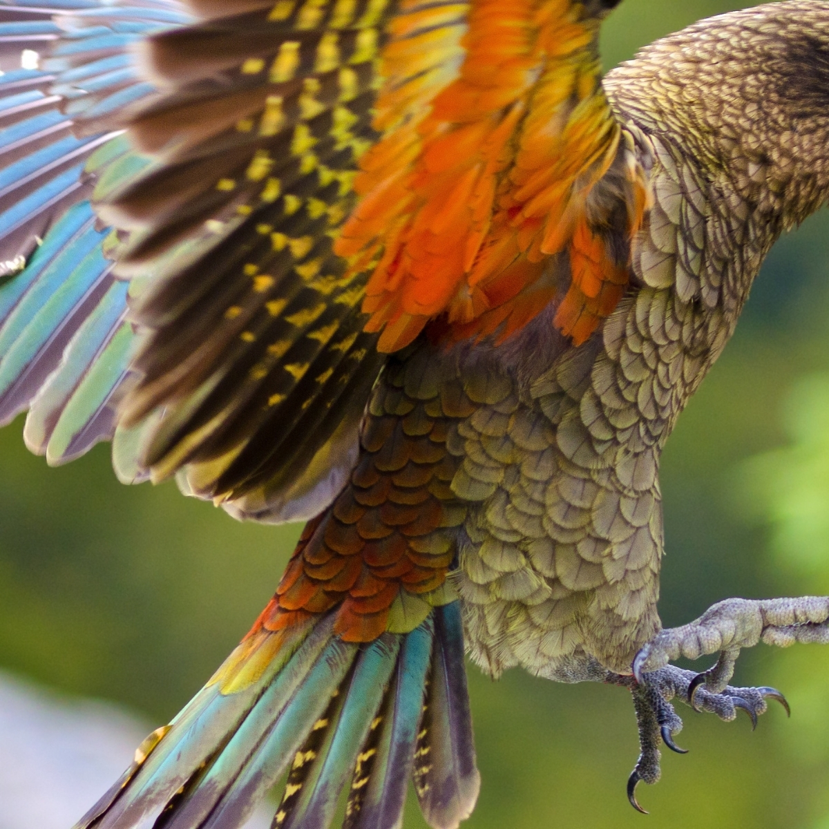
Flora & Fauna Palette
Koe
The Koe palette is inspired by the bright bursts of colour, captured in the native flora and fauna of Aotearoa. From the vivid magentas of the Pūriri tree, bejeweling the bush with splashes of colour through winter, to the golden yellows of the Kōwhai signaling spring. Vibrant colours provide an uplifting sense of warmth and connect us to the change in seasons. Bold and bright colours when used sensitively, can have a powerful impact, bringing a sense of fun to a range of interiors. In multifunctional spaces, contrasting areas can mark out zones. Whether a space is dedicated to leisure or business, the Koe palette alongside thoughtful design, can enhance the desired effect: relaxing, revitalising, and inspiring. Combine complementing colours in the palette for a variety of effects in a public space, or use just one as a simple, clean backdrop to bring a distinctive personality and heighten the mood of a private guest room.
More Information
New Zealand Hospitality Product Palettes Viewbook